Theme settings, templates and publishing
Change your theme's colours and fonts, make a new template, publish your changes to the store, or throw them away.
This page finishes the work in the theme editor: the settings for the whole theme, a template of your own, and showing your changes to buyers.
Theme settings
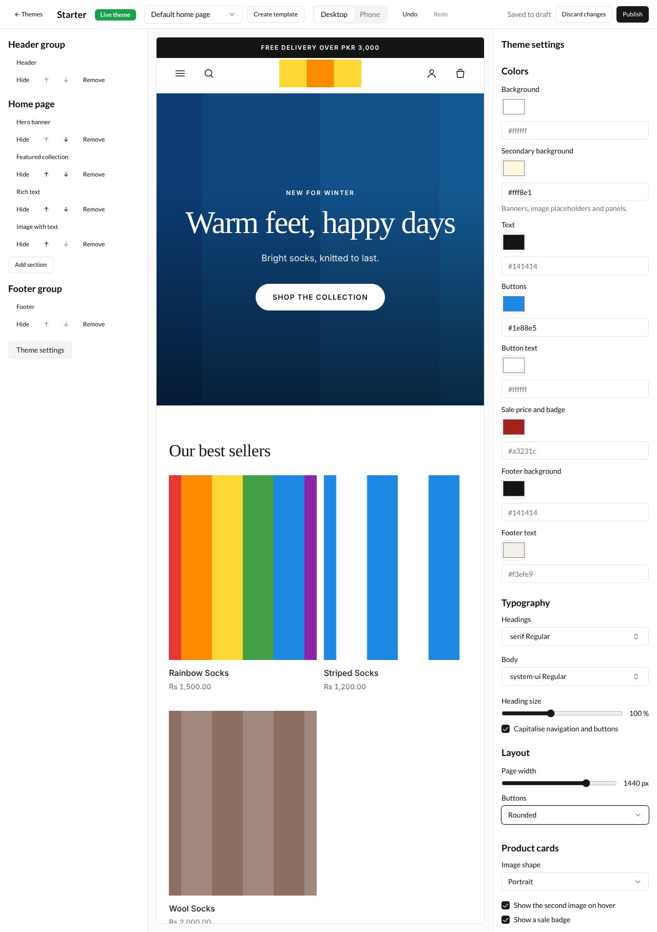
Theme settings change things across every page, such as colours and fonts. Press Theme settings at the bottom of the section list. The settings on the right are in four groups.
| Group | Box | What it changes |
|---|---|---|
| Colors | Background, Secondary background, Text, Buttons, Button text, Sale price and badge, Footer background, Footer text | Each colour. Secondary background is for Banners, image placeholders and panels. |
| Typography | Headings and Body | The font of headings and of other words |
| Heading size | How big headings are, from 80 to 130 % | |
| Capitalise navigation and buttons | Ticked, menu links and buttons are in capital letters | |
| Layout | Page width | How wide the page can get, from 960 to 1600 px |
| Buttons | Rounded or Square buttons | |
| Product cards | Image shape | Portrait, Square or Landscape product pictures in lists |
| Show the second image on hover | Shows a product’s second picture when the mouse is over it | |
| Show a sale badge | Shows a sale badge on products with a lower price |
Change a colour
Each colour has a small coloured square and a box with its code, such as #ffffff for white. Either:
- press the square and pick a colour, or
- type a colour code in the box, such as
#1e88e5for blue. An empty box shows the theme’s own colour in grey.
Here the Buttons colour is #1e88e5, the Secondary background is #fff8e1 and Buttons under Layout is Rounded. The preview’s button is blue and round.
Every kind of setting
Sections, blocks and theme settings use the same kinds of boxes. Here is each kind the starter theme has, and where you met it:
| Kind | How you use it | Example |
|---|---|---|
| Text box | Type words | Heading in Hero banner |
| Web address | Type a path on your store, such as /collections/best-sellers, or a full address |
Button link in Hero banner |
| Rich text | Type words and use its buttons for bold, italic, underline, strikethrough, headings, lists and links | Text in Hero banner |
| Slider | Drag it; the number on the right shows the value | Image overlay, Logo width, Products per row on desktop |
| Drop-down list | Press it and pick one choice | Height, Alignment, Buttons |
| Tick box | Tick it to turn it on | Image first, Open by default |
| Colour | Press the square, or type a colour code | Buttons under Colors |
| Font | Press it and pick a font | Headings under Typography |
| Image | Choose a picture from Files; then Change or Remove | Image in Hero banner, Logo in Header |
| Collection | Choose a collection | Collection in Featured collection |
| Page | Choose a page | Content from a page in a Collapsible tab |
| Menu | Choose a menu | Menu in Header and Footer |
The starter theme has no setting that picks a product (only a collection). Themes you upload may have one; it works like the collection one, with a Choose a product window.
Create a template
A new template is a copy of the one you are editing, which some pages can use instead of the default. For example, a page template with an extra picture, for your size guide.
-
In the Template list, pick Default pages under Pages.
-
Press Create template in the top bar. The Create a pages template window says A copy of the template you are editing, which pages of this type can use instead.
-
Type a Template name: Lowercase letters, digits, hyphens or underscores, such as wide. A name with capitals or spaces, such as
Wide page, is refused with Use 1 to 50 lowercase letters, digits, hyphens or underscores.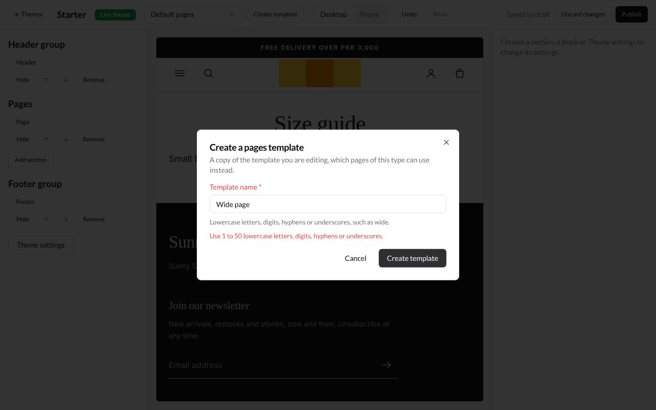
-
Type
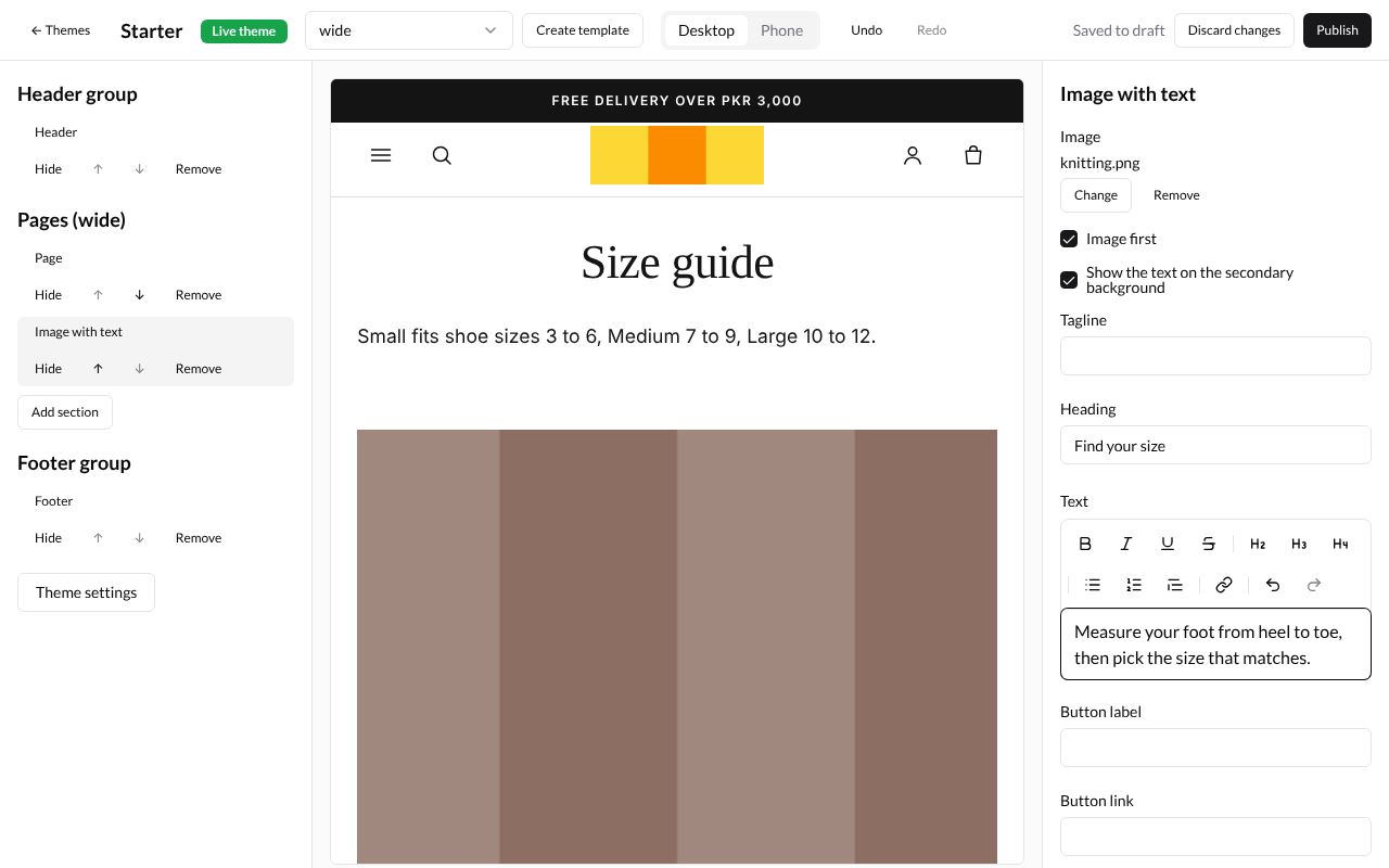
wideand press Create template. The Template list now shows wide, and the section list is called Pages (wide). -
Change it like any template. Here an Image with text section is added under Page, with
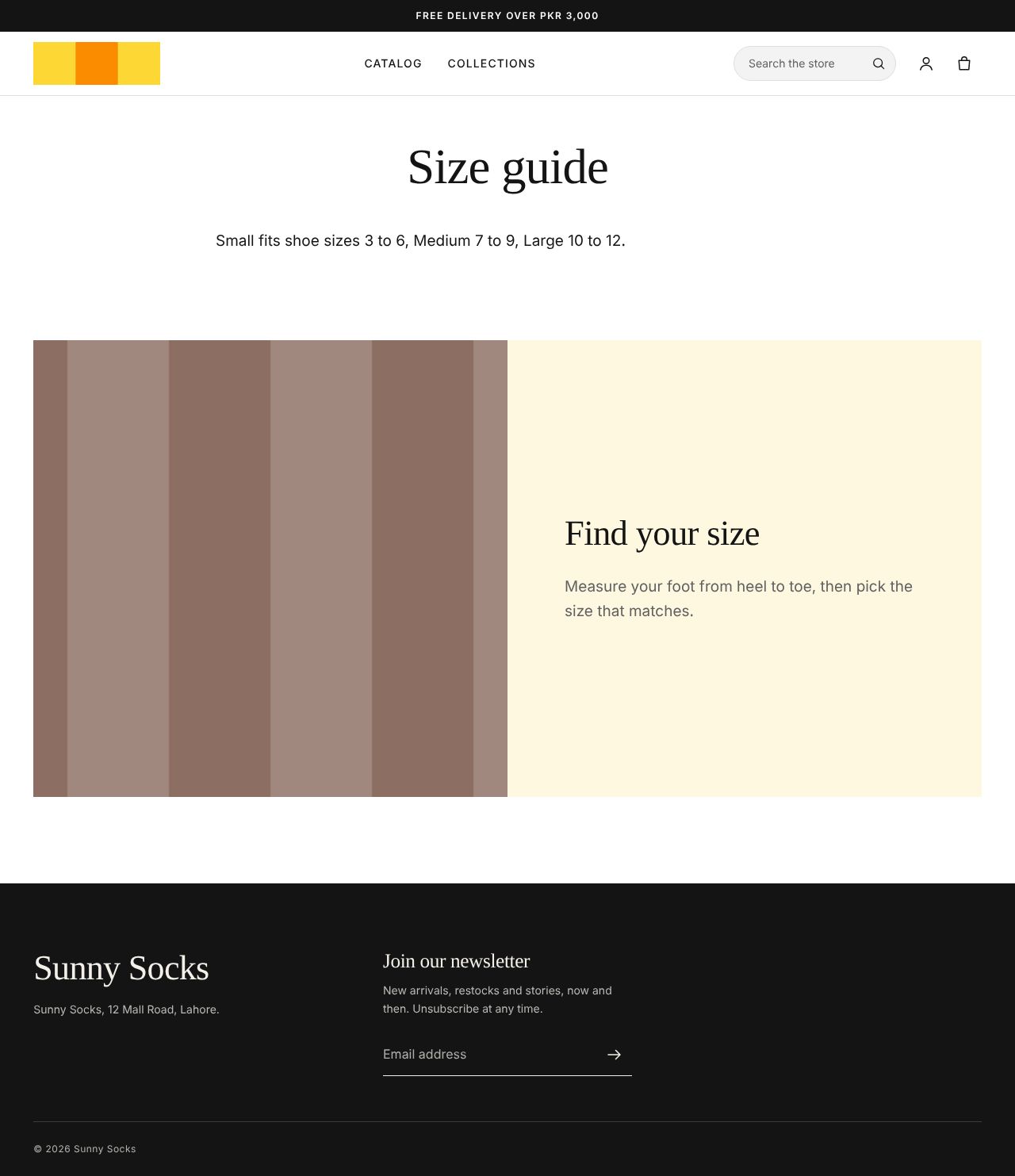
knitting.png, the headingFind your sizeand the textMeasure your foot from heel to toe, then pick the size that matches.
A page only uses the new template once you choose it for the page: see Use the template on a page below.
Publish
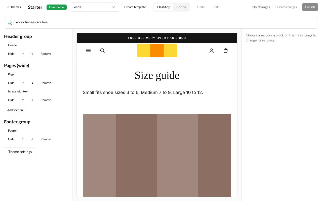
When you are happy with your changes, press Publish at the top right. The editor says Your changes are live. and the top bar says No changes again.
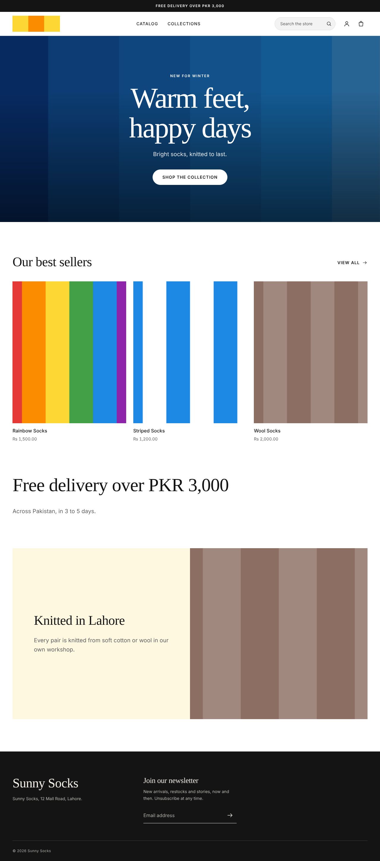
Buyers now see your changes. Here is the store’s home page, with the new logo, the announcement bar, the blue banner, Our best sellers, Knitted in Lahore and the footer text:
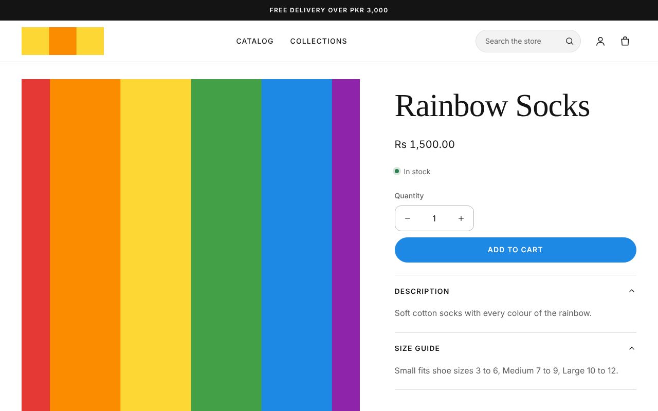
And a product page, with the new Size guide tab open under the description:
Discard changes
To throw away everything you changed since you last published:
-
Press Discard changes in the top bar.
-
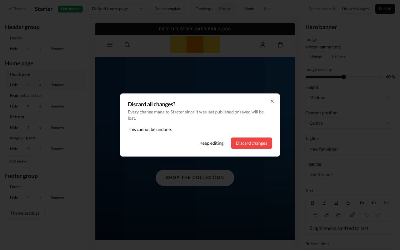
A window asks Discard all changes? and says Every change made to Starter since it was last published or saved will be lost. and This cannot be undone.
-
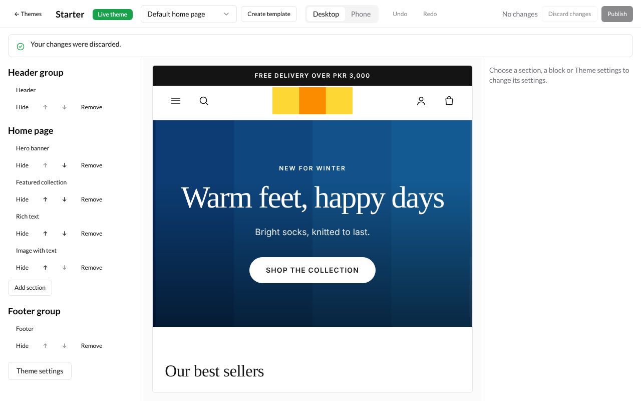
Press Discard changes. The editor says Your changes were discarded. and the preview goes back to what buyers see. Press Keep editing instead to keep your draft.
Use the template on a page
-
Press ← Themes to leave the editor. In the sidebar, press Pages (under Online Store) and open the page, here Size guide (see Pages).
-
In the Theme template card, type the template’s name in Template suffix:
wide. The box says Uses the theme’s page.<suffix> template when it has one. Leave blank for the default page template.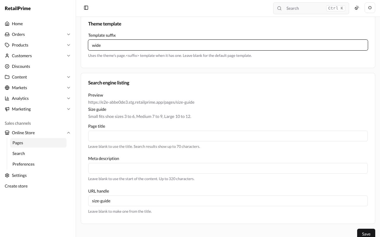
-
Press Save.
The page on your store now has the picture and Find your size under its text:
Products, collections, blogs and blog posts have a Template suffix box too, which works the same way.
What’s next
Pages: write pages such as About us for your store.